By: Daniel Taveras
Though gaming has more or less always been about the games, the designs of the consoles created to play them are as interesting to look at as many of the titles released for them. Since consoles historically have merely been a conduit to the experience, their designs have been completely at the behest of the manufacturers. What factors went into their design decisions? Functionality? Personality? With this all in mind, from a visual standpoint, we’re going to count down the best console designs of all-time. The console’s controllers were not factored into the decisions (they may get their own list someday), and handhelds were also exempt. We start at number fifteen…
15. Magnavox Odyssey
Released: 1972
Designed by gaming godfather Ralph Baer, the Magnavox Odyssey is considered the first true home gaming console. A far cry from the original “brown box” prototype design, the retail version of the Odyssey befits its interstellar moniker. Shaped a bit like a UFO and employing a font reminiscent of 70’s Sci-Fi, the Odyssey set out to visually represent the future in a compact, local, space-age device.
14. Vectrex
Released: 1982
A unique entry in the annals of gaming, the Vectrex offered an integrated vector monitor that displayed sharp vector lines on the play screen. This graphical fidelity, alongside the consoles all-in-one design, makes it a visually striking system. Turning the monitor on and letting those bright vector graphics shine really sells its look. Since the monitor’s an included part of the system, the gameplay and iconic home screen bleed into its design, and cement its spot on this list.
13. Nintendo Entertainment System (Model NES-101)
A.K.A. “The Top-Loader”
Released: 1993
The original Nintendo Entertainment System is arguably the most well-known and beloved video game console ever. For as much love and adoration the console gets, frustrations with the hardware unfortunately made “blowing into the cartridge” an all-too-familiar event. Its redesign, based on the Family Computer’s Japanese redesign, addressed that common issue and radically altered the system’s outward appearance. Though it’s an admittedly odd-looking piece of technology, the super condensed design makes it among the smallest home consoles. Since NES games now load from the top, the wonderful label art is fully visible instead of tucked away in a darkened tray. The curves and edges on this interestingly molded console make it stand-out in a very good way.
12. Atari 5200
Released: 1982
Atari’s legacy seems to begin and end with the 2600. Though more powerful, the 5200 faltered in sales comparatively and remains a fairly forgotten system. Discounting its failure as a follow-up, the 5200 is mega sleek and bears the appearance of a high-end piece of premium 80’s technology. Its sharp lines, along with the bold silver bar running across elevate the hardware from gaming console to elegant showpiece.
11. Sega Genesis (Model 1)
Released: 1989
The Sega Genesis will always be remembered alongside the Super Nintendo. The bitter console war of the 90’s saw politician-like attack ads from both parties (Genesis does what Nintendon’t). Though the SNES may have won that skirmish, on the design front the votes decidedly stack in Sega’s favor. The Darth Vader black adorning the outer hull of the Genesis appeared menacing and brilliant in 1989, ready to usher in a new 16-Bit era for gaming.
10. Nintendo Color TV-Game 15
Released: 1978
Nintendo’s first dip into console gaming wasn’t actually the NES. The Color TV-Game series was a sequence of Pong clones (ahem…”light tennis”) that paved the path for the Nintendo Entertainment System. While most Pong consoles stuck to browns, creams, and wood finishes (the stock pattern of the 70’s) the Color TV stands out with its bright orange exterior. In what was essentially a remake of a far too iterated upon title, Nintendo’s version is eye-catching and appears as much fun as it plays.
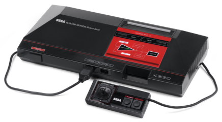
9. Sega Master System
Released: 1986
American and Japanese markets never saw much of the Master System. The NES held a stranglehold, and with titles like Mario and Zelda lining up at the opposing gate the Master System just couldn’t compete. In Europe and Brazil however, where the NES was less readily available, the Master System flourished. The same color scheme used for the Master System was transferred to the Genesis, but it’s more remarkable here. The facsimile on/off diagram used for the power indicator light is brilliant, and the touches of silver outlining the lettering is gracefully done.
8. SuperGrafx
Released: 1989
The PC Engine was the Japanese equivalent to the TurboGrafx-16, and the SuperGrafx was designed to be its successor. Only seven games were released for the SuperGrafx, and because it was barely a marginal upgrade from the PC Engine it never saw success. Despite its limited power, the SuperGrafx looks like the muscle car of consoles. The weighty grey accompanied by big blue block text portrays the SuperGrafx as a serious gaming machine. This thing’s heavy duty, like it’s been riveted together piece by piece and hand delivered to you by the welder that made it happen. Though that bad-ass case basically housed a PC Engine and a half, attitude gets it a long way.
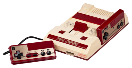
7. Family Computer (Famicom)
Released: 1983
This NES equivalent appeared in Japanese stores a full two years before it landed on American shelves. Along the way, the Famicom’s show-stopping design was lost in translation. The red and gold color scheme feels classic and rich, and the ergonomics are more in line with top-notch toys than video games. While in some ways less practical than the American version (varied first and second player controllers that were hardwired in, and cords that were mercilessly short) the amusing appearance of the console puts the big grey box seen in the states to shame.
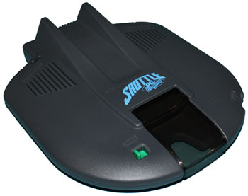
6. PC Engine Shuttle
Released: 1989
This variant to the popular PC Engine wins points for being one of the few video game consoles to attempt to mirror the appearance of something else. The Shuttle mimics what its name implies, and the smooth curves coupled with the convincing plastic cockpit set the bar for how cool a console could be. Though the “toyness” of the piece might seem cheesy to some, NEC’s drive for difference and fun styling make the PC Engine Shuttle a pleasurable sight for both gamers and non-gamers alike.
5. PlayStation 3
Released: 2006
The PlayStation 3 was the console to end all the consoles. PlayStation 2 had just kicked everyone’s ass, and Sony was setting gamers expectations through the roof. It was going to be more powerful than God, smarter than Einstein, and sleeker than an Apple product soaked in cooking oil. Though the PS3 had a relatively weak launch its gained face since then, and the system’s original glossy “grill” design is powerful and impressive. The one drawback of this beautiful piece of tech is the font chosen to spread across the console’s dome. At first glance it may look sleek, but once you realize it’s the same font used by Sony for the Spider-Man movies it makes you wonder why they couldn’t have been more creative with the typeface.
4. Xbox 360 S (Glossy)
Released: 2010
Microsoft’s Xbox 360 has been a huge success, but the console’s failure rate demanded a redesign. Enter the 360 S. Taking cues from Sony’s PS3, the glossy 360 S compacts the original 360 design and sharpens the lines. The air vents take a magnificent diagonal course in a move that combines function with gracious form. The 360 S is a marked improvement over the original white clump that was the launch 360.
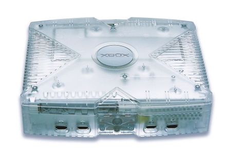
3. Xbox Crystal Limited Edition
Released: 2004
The massive black brick of a console known as the Xbox was designed with a smugness and arrogance that only Americans seem to be able to conjure up. All the better, as the Xbox was arguably the coolest looking console of its generation. There was a massive amount of limited edition Xbox’s, enough to fill this entire list, but the freshest of all was the Crystal Limited Edition. A European (and Canadian) exclusive, it was created in limited numbers to commemorate the console’s European birthday. The transparent, white tinted case is frosted just enough to add some intrigue to the system’s interior. Making it completely translucent would’ve cheapened the effect, and as it stands it’s subtler (and more effective) than it could have been.
2. PSX
Released: 2003
Japan gets all the cool shit. The PSX was part DVR, part PS2 and was prohibitively expensive at launch (79,800 yen or around 670 2003 US dollars). Its ultra-modern design is fantastic and fetching; colored with a ceramic white paint job that sweats class. It was massive and unreliable, but damn if it didn’t make you feel like it was 2001 (The movie year, not the real year).
1. Panasonic Q
Released: 2001
Japan gets all the cool shit; again. The Panasonic Q came about from a deal brokered by Matsushita (owners of Panasonic) and Nintendo. Matsushita agreed to produce the disk drives installed in Gamcubes while Panasonic got to create a DVD-powered cube of their own. The Q was basically a supped up version of the Gamecube, including all the bells-and-whistles the Cube lacked. DVD player? Check. 5.1 Surround Sound? Check. Digital readout? Check. The glassy, mirrored face of the console is startling. Blue LEDs illuminate the controller ports, and their reflections off the glass deepen the effect. Panasonic perverted the oft-laughed at “handle” and stylishly integrated it into the design. Now they’re more like wings, cascading across the console, gently hugging the digital display. It’s a shame this system wasn’t more readily available, for its expanded existence may have help save the Gamecube’s reputation as nothing more than a cute purple box.
*Image courtesy of vocalogreen (ebay)


